Happy Homes Animal Shelter

-
This is a concept project for the Google UX Design Certification where I assumed the following roles:
User Experience (UX) Researcher
Interaction (IxD) Designer
User Experience (UX) Designer
User Interface (UI) Designer
-
Interaction Design: High-fidelity interactive prototypes for a responsive website.
UX/UI:
Competitive analysis
User Interviews
Site map
Personas
UI kit
Low-fidelity wireframes
High-fidelity mockups and prototypes
Usability tests and findings
-
Duration: 2 months
Tools: Figma
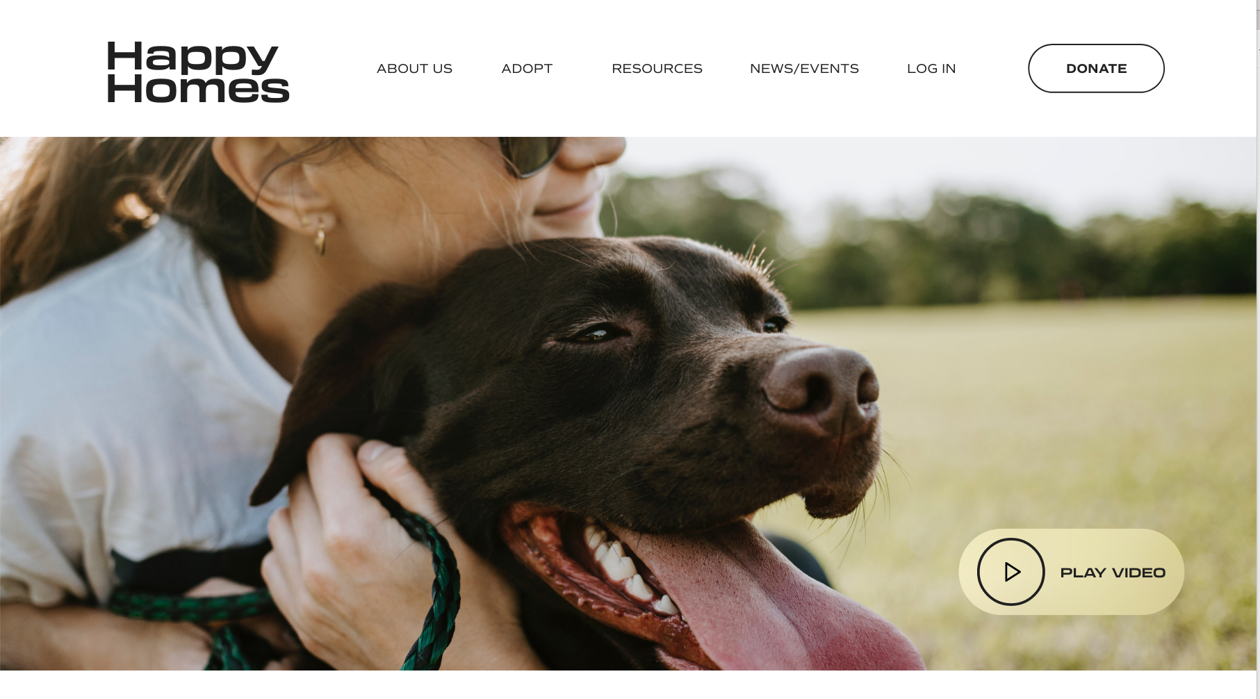
Helping pets find their furever home
Happy Homes is a small, local animal shelter in Westview, NJ. Incorporated in the 1950’s as Westview’s first nonprofit animal welfare organization, Happy Homes has grown to be the area’s premier no-kill shelter. In 2022 the Happy Homes team decided it was time to expand their market reach for pet adoptions, but to do so, they needed a responsive website.

The challenge
Pet adoption is an overwhelming experience. Finding a trust-worthy shelter, and a pet that matches your needs and preferences can be difficult.
The objective
Design a responsive website for Happy Homes Animal Shelter that provides ample information about the shelter and pet adoption process, and matches users with pets based on their needs and preferences.
Research
First, I conducted interviews with three animal lovers to understand their feelings and pain points when inquiring about a pet on an animal shelter website. I then created empathy maps, personas, and journey maps to organize and prioritize feedback.
Through my research, I identified two user groups: experienced pet owners who have adopted from an animal shelter in the past, and non-pet owners or previous pet owners who have not gone through an adoption process.
Findings
Credibility: Users are more inclined to attend an adoption event, or inquire about a pet on the web if the shelter is transparent about their mission, how they care for the pets, and their adoption process. If the shelter seems enthusiastic about finding pets the right home, the user is more likely to trust them.
Videos: It’s hard to get to know an animal online. Images are the best way to initially spark interest in an available pet, but videos are key for a user to understand the pets personality and determine if they are a match.
Animal History: Users identified animal history - like whether or not the pet is socialized, disabled, or neutered, or the reason why they were given up - as an essential piece of information before they inquired to adopt.
“I like when they [the shelter] show you what you should do and what questions to ask, because if you’re just starting out, you don’t know.”
— Interview Participant
Personas
Based on patterns from my user insights I developed two personas:
Wanda is an expecting mother who’s Jack Russell, Sparky, passed away. She wants to find a new pup that is socialized and hypoallergenic for her twin boys. Wanda didn’t adopt in the past so she is also looking for resources on how to do so.
James is a retired USMC pilot who is partially disabled. He’s looking for an emotional support dog to keep him company and help him with daily tasks. He want’s to make sure his dog is independent and has lower energy levels.


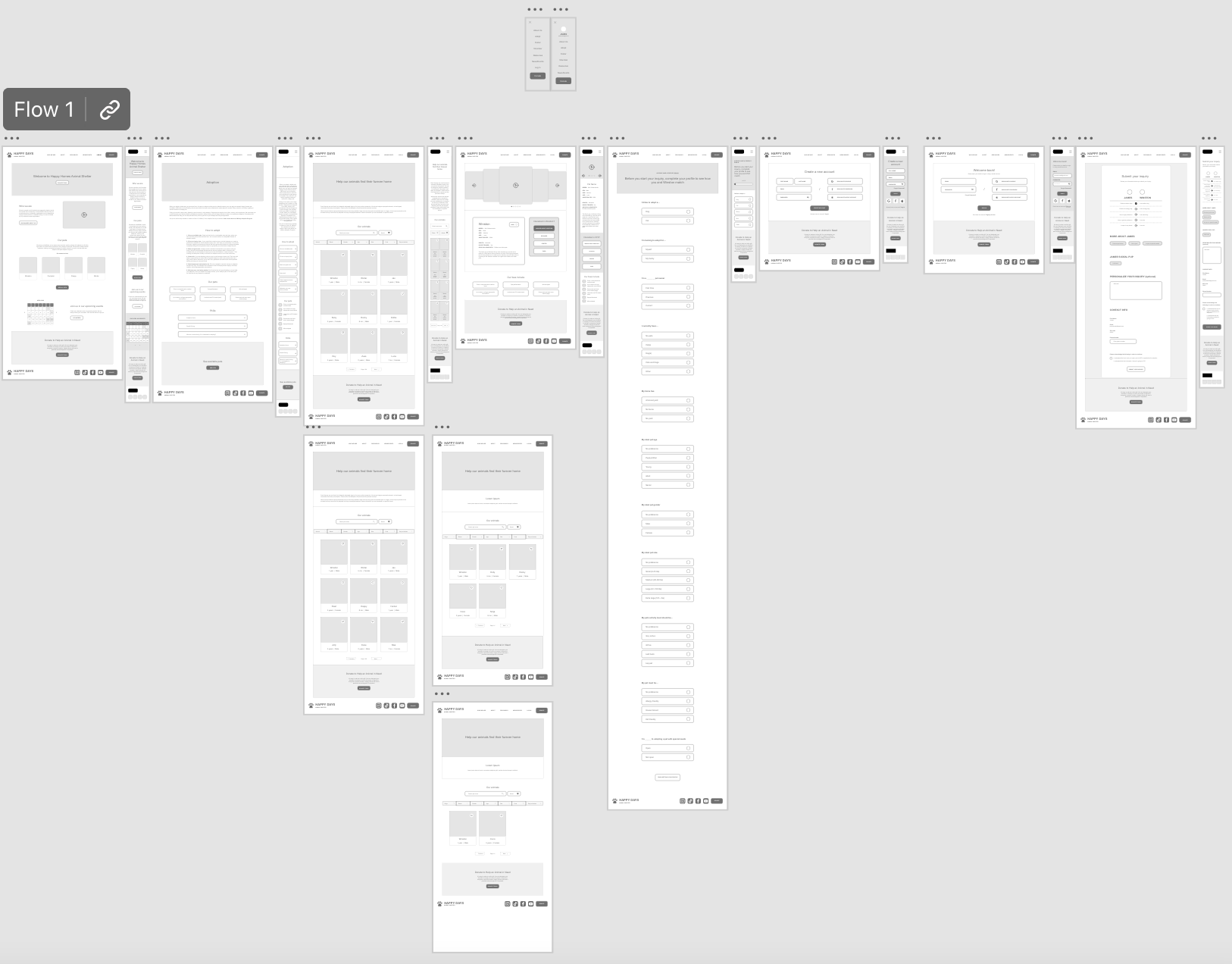
Wireframes
I used big-picture and up-close storyboarding, and crazy 8’s methods to quickly iterate on my ideas.


As the initial design phase continued, I made sure to base screen designs on feedback and findings from the user research. Advanced filtering options and personalized matching were a key user needs addressed in the early designs.


Low-fidelity prototype
Using the completed set of digital wireframes, I created a low-fidelity prototype. The primary user flow I connected was browsing and available pets inquiring about adoption, so the prototype could be used in a usability test.
Usability study findings
I conducted two rounds of usability studies. Findings from the first study helped guide the designs from wireframes to mockups. The second study used a high-fidelity prototype and revealed what aspects of the mockups needed refining.
Round 1
Users were confused about the language used in the profile questionnaire section. They wanted clarification on whether or not the survey was asking if the user was a first time pet owner or a first time pet adopter.
Users also wanted a list of the number of questions asked in the questionnaire, so they had an idea of how long it would take.
Users wanted larger fonts on the buttons, text was too small
Round 2
It wasn’t obvious to users that there was a custom match system. That a user could fill out their profile and see which pets matched with their wants and needs.
Users noticed an animation glitch while hovering over buttons on a few of the core pages.
Refining the design
Early design tests revealed confusion around the language used in some sections. I added clarifying questions in the questionnaire and included the number of questions asked at the top of the page.
Before Usability Test

After Usability Test

Before Usability Test

After Usability Test

The second usability study revealed confusion around the customized experience available to users once they create a profile. After the second usability study, I added a banner on the homepage and a section on the adoption process and available pets pages to prompt users to inform users of the special custom feature, and prompt them to create a profile.
Before Usability Test

After Usability Test


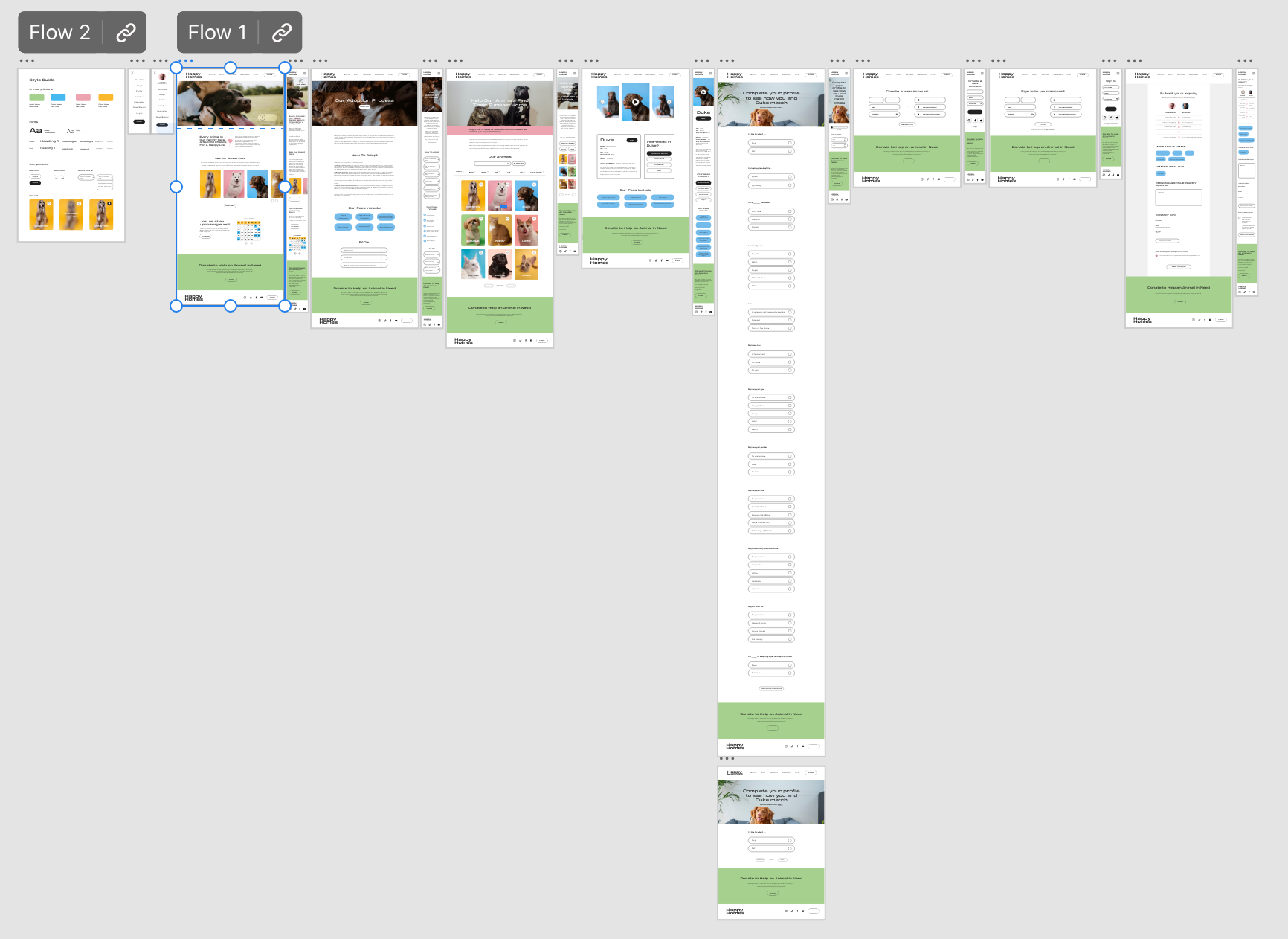
High-fidelity prototype
The final high-fidelity prototype presented cleaner user flows. It also met user needs for a customized experience to make sure the pet they adopt is right for them. Check out the high-fidelity prototype below.
Accessibility considerations
I used simple design with bold, colorful imagery to generate a happy emotional response among users. When text was applied over imagery, I used background blur to make the text stand out against the background.
I used consistent colored backgrounds so users would understand where they are on a page and what action to take in the specific area they are in.
I used banners to help guide users in creating a profile and customizing their experience.
Impact
This design makes users feel excited about the pet adoption process. The use of color, videos, and imagery helps to build trust in the organization. Users can easily find available pets and have a customized experience while doing so. After completing a profile users will see how they match with each of the available pets.
“I think this website is one I would go to to adopt a dog. It’s easy for me to navigate and find information. As a disabled veteran, I highly appreciate the customization.”
— User feedback
What I learned
While designing the Happy Homes responsive website, I learned the importance of prioritizing both the desktop and mobile versions of a website. In the beginning I often found myself prioritizing desktop over mobile, which let to interactive design issues when it came to testing wireframes. Making sure I create mobile and desktop versions of the website at the same time are key in creating a seamless user flow and experience.
Next steps
Conduct another round of usability studies to validate whether the pain points users experienced have been effectively addressed.
Conduct more user research to determine new innovative design solutions.
Try it out!
Click the image below to jump in the app!