
Problem area
Existing apps designed for Type 1 or Type 2 diabetes, don’t address the unique needs of gestational diabetes (GD)
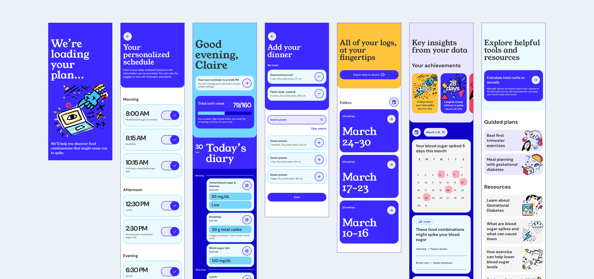
I came up with the idea for the “Oh Momma” mobile application after seeing a family member struggle to manage gestational diabetes. Diabetes applications on the market fail to consider pregnancy-related factors like fluctuating blood sugar, dietary restrictions, and the emotional challenges of managing the condition. There was a clear gap in compiled resources tailored to pregnant women's experiences.
My vision was to create a solution that could reduce stress, increase confidence, and enable proactive health management from day one of diagnosis.
Where pregnant women with GD struggle most
Issue 1
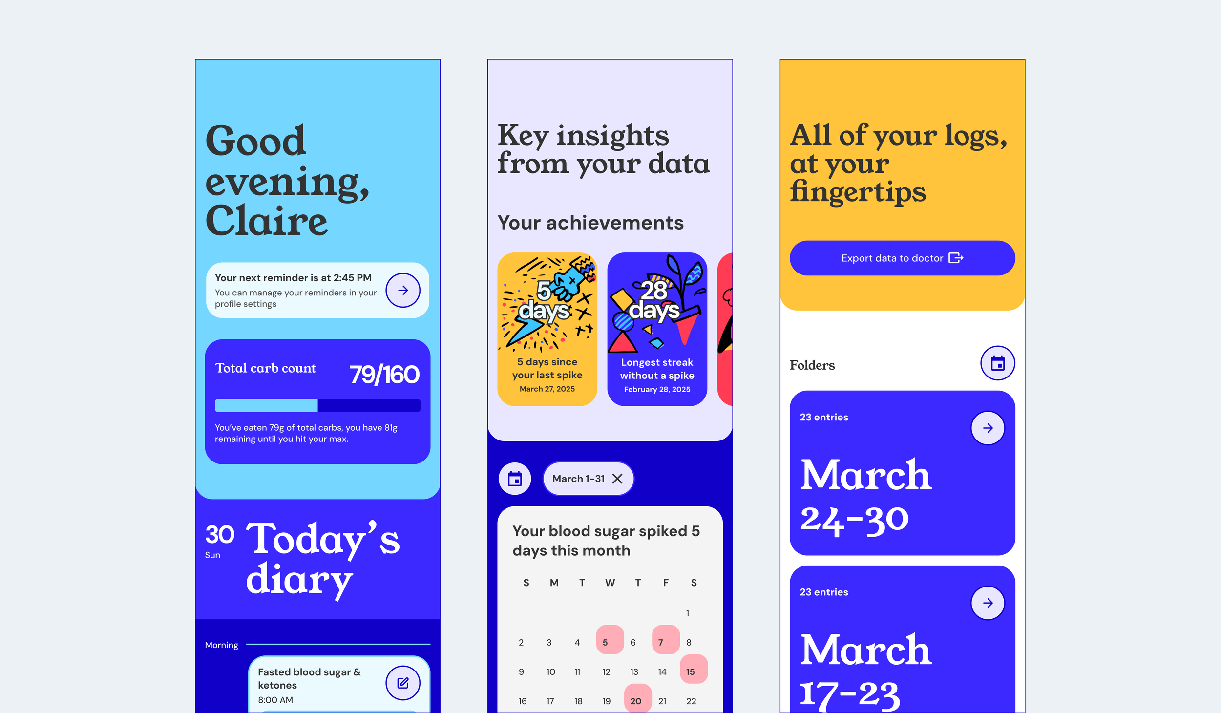
Users struggle to spot trends or unusual spikes over time because their notes are scattered between paper and phone apps.
Issue 2
Users often forget to set alarms or timers, causing them to miss critical moments for blood sugar monitoring or eating.
Issue 3
Calculating total carbs for each meal is time-consuming, slowing down meal prep and grocery shopping.
Design decision 01
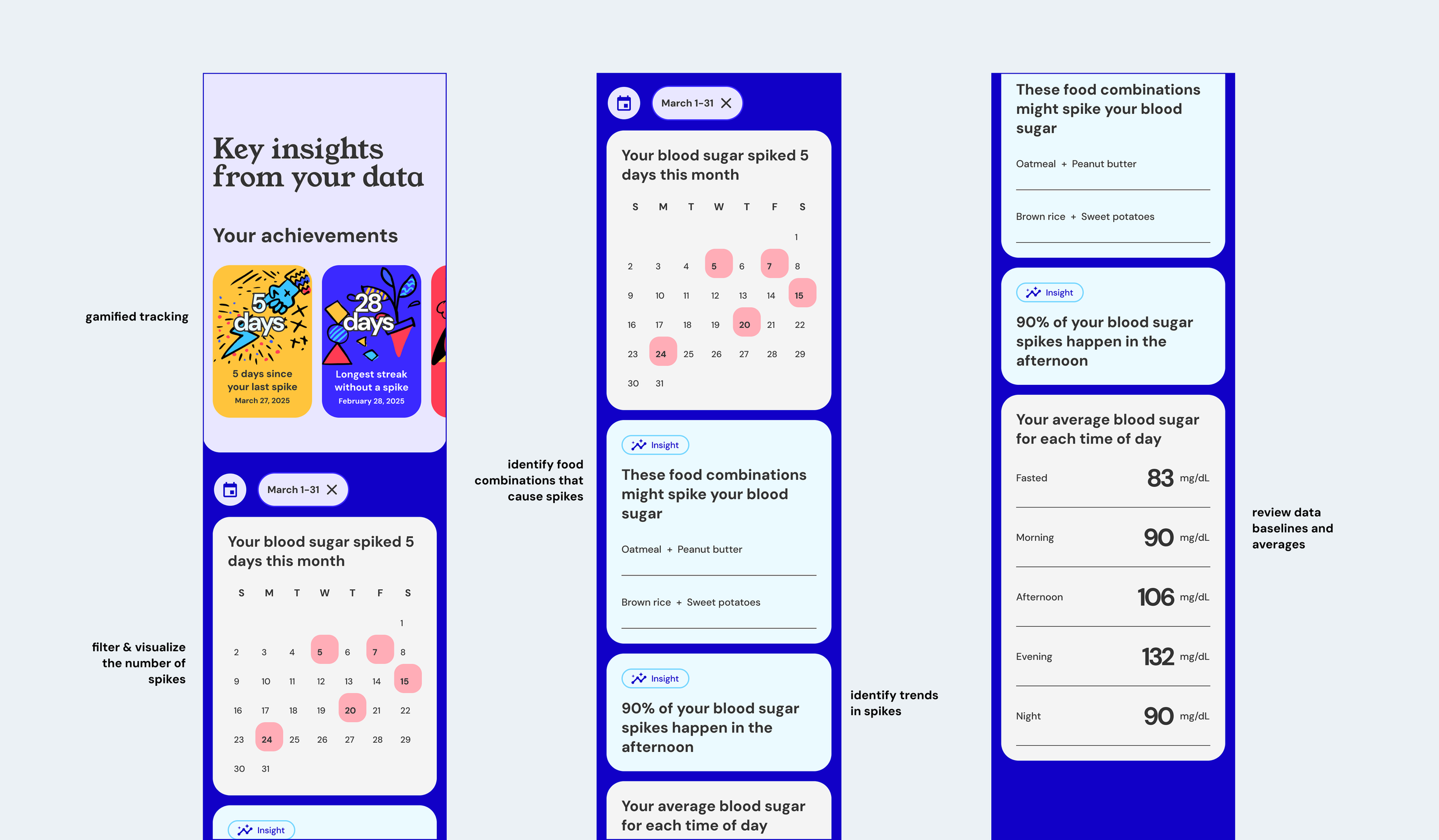
Trend visualizations and repositories with AI-generated insights to help uncover the root cause of blood sugar spikes
Understanding the root cause of blood sugar spikes is crucial in gestational diabetes management because it helps tailor diet, medication, and lifestyle to prevent dangerous pregnancy complications. Oh Momma not only visualizes trends, it digs deeper to understand what food combinations might cause a spike and can predict spikes to help users make more informed meal planning decisions.
Trends in data
Design decision 02
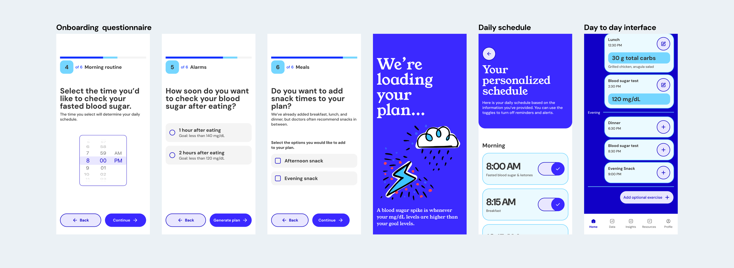
Personalized daily schedule based on goals and existing routines
A personalized schedule for food and glucose-check alarms adapts reminders to each user’s real eating habits, glucose patterns, and daily routine. Instead of fixed, generic alerts, the system learns when users typically eat or need to check their levels and schedules prompts at the most helpful moments. This reduces missed meals or checks, supports more stable blood-sugar control, and makes daily management feel smoother and more intuitive
Set up and schedule
Design decision 03
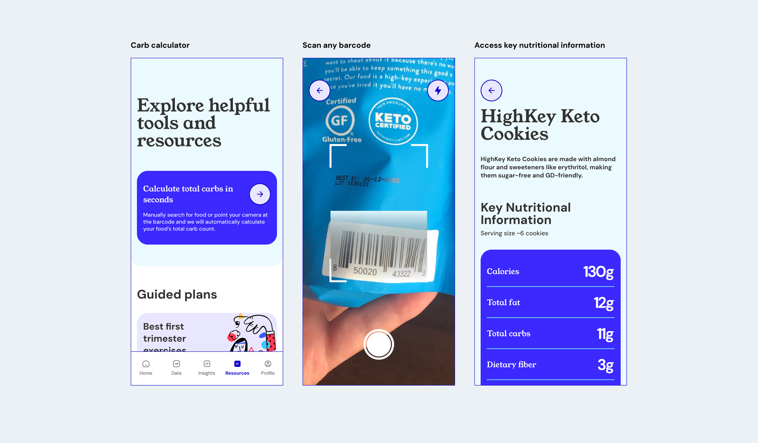
One-click to calculate total carbs
Users commented on how difficult it was to go grocery shopping or eat out at restaurants because they would have to manually calculate the total carbs for the food items they wanted to purchase. Oh Momma simplifies this experience through the Total Carb Calculator. Users simply describe their meal or scan the product barcode to receive information on carbs.
Carb calculator
Retrospective
Designing for social good
This project was a testament to the importance of thorough user research and iterative design in creating solutions that truly meet user needs. It honed my skills in collaboration, problem-solving, and effective communication, setting a solid foundation for my future endeavors in UX/UI design.
"Yeah, I would definitely use this if it were available. It would make my life so much easier, especially when I go to my doctors visits - having all of that information readily available with the option to export is huge. Also love the colorful design."
Interviewed User
Other projects
-
🔒 Driving org-wide CX adoption through an AI/ML-powered dashboard
-
🔒 Increasing accuracy and process efficiency by 70% through automated screening
-
Increasing demo requests by 28% through a redesigned solutions landing page