
Urban Dogs
-
This is a concept project where I assumed the following roles
Interaction (IxD) Designer
User Experience (UX) Designer
User Interface (UI) Designer
-
Interaction Design: High-fidelity interactive prototypes for key tasks on mobile application
UX/UI:
Competitive analysis
User Interviews
Site map
Personas
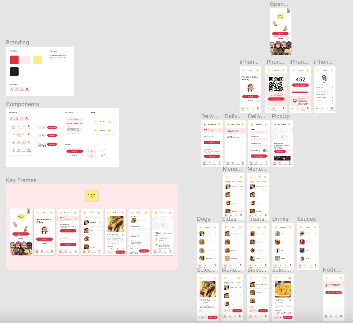
UI kit
Low-fidelity wireframes
High-fidelity mockups and prototypes
Usability tests and findings
-
Duration: 4 months
Tools: Figma
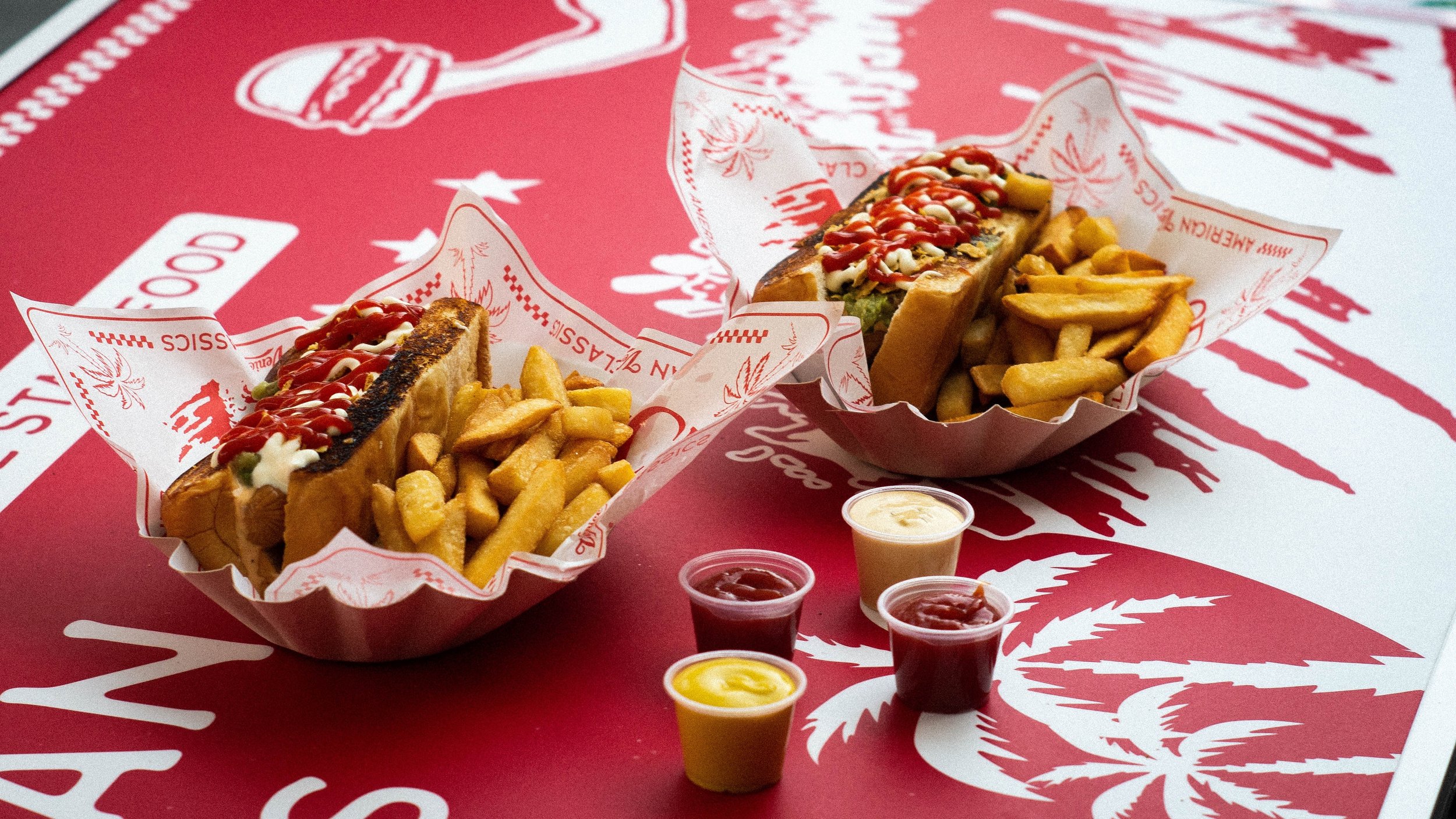
A playful, minimal design for a new hot doggery
Urban Dogs is a new gourmet hot dog restaurant located on Long Island, NY. The Urban Dogs app was created to give customers the ability to skip lines, save time, minimize social interaction, see ingredient lists, and schedule deliveries within minutes. This application primarily targets commuters and adults who lack the time or ability to prepare dinner.


Challenge
Busy workers and commuters lack the time necessary to prepare a meal. Additionally, food allergies complicate mobile ordering.
Solution
Design an application for Urban Dogs that allows users to easily order meals - providing them with the information they need to make safe choices regarding dietary restrictions and food allergies.
Research
First, I conducted interviews with six willing participants to understand their feelings towards ordering food via a mobile application. I then created empathy maps, personas, and journey maps to organize and prioritize feedback. A primary user group identified through the research was working adults who don’t have time or energy to cook meals.
This user group confirmed my initial assumption of mobile customers - that they are strapped for time - but research also revealed some users are hesitant to use mobile apps. A subsection of the group stated that a pain point in using a mobile application to order food, rather than in person or over the phone, is that complicated interfaces make it difficult to communicate and confirm dietary restrictions with staff members.
Findings
Time: Working adults are too busy to spend time on meal prep - that is why so many people take advantage of mobile ordering food. It’s quick, easy, and the user doesn’t have to worry about interacting with other people if they don’t want to.
Accessibility: Many food-ordering applications are not equipped to handle food allergies. Lack of confirmation for order changes and severe allergies will often deter customers from using an application.
Perks: Some applicationss don’t have a customer loyalty program. Loyalty programs are the key to creating reoccurring purchases.
“It’s so frustrating when the customization options are limiting, I prefer to talk on the phone because I can quickly confirm substitutions were received.”
— Interview Participant
Personas
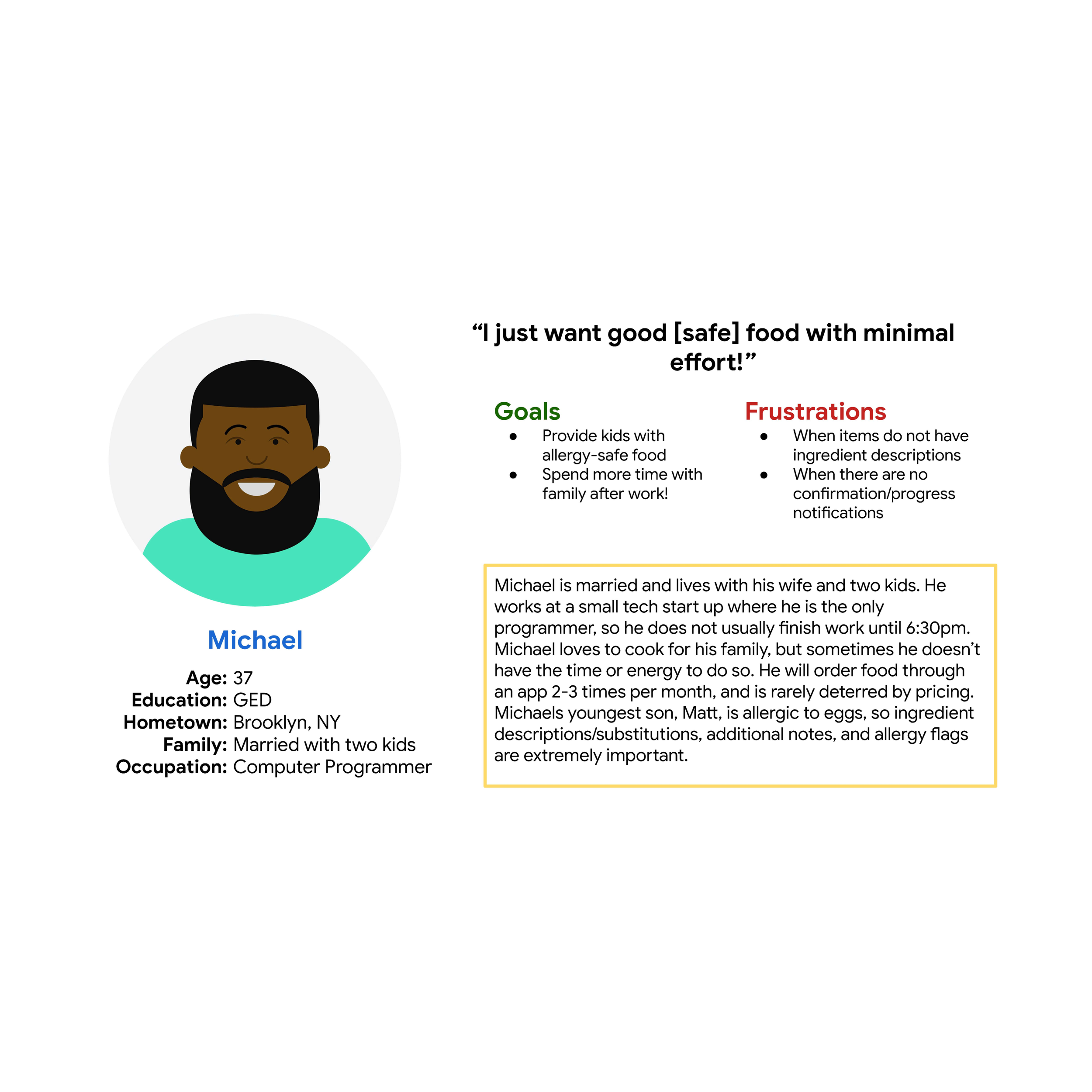
Based on patterns from my user insights I developed two personas. Patti is a recent graduate working as a teacher. Her goal is to save time, energy, and social contact by ordering food from a restaurant to pick up on the way home from work. Michael is married with two children, one of which has a severe food allergy. Michael orders food for his family 2-3 times a month but needs to make sure the food is safe for his child to eat. I focussed on Michael’s persona.

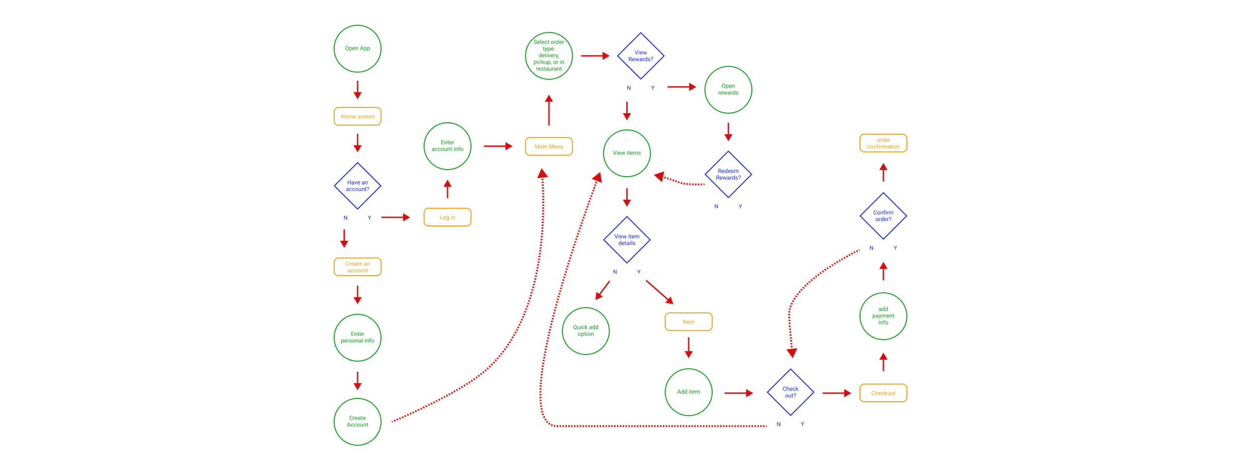
User flow
Before taking my ideas to paper, I wanted to outline the flow a user would take within the application. This helped me understand the key frames I would need to build out in my paper and digital wireframes.
Wireframes
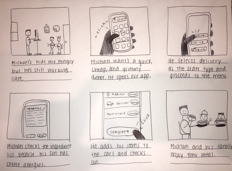
I used big-picture and up-close storyboarding, and crazy 8’s methods to quickly iterate on my ideas.
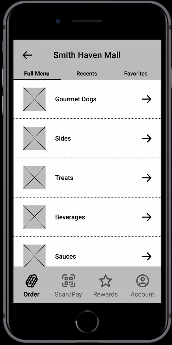
After sketching, I prioritized a quick and easy ordering process to help users save time. On the item pages, I included drop-down items for ingredients and allergy information.
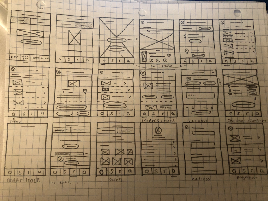

As the initial design phase continued, I made sure to base screen designs on feedback and findings from the user research. Easy navigation was a key user need to address in the designs.
Low-fidelity prototype
Using the completed set of digital wireframes, I created a low-fidelity prototype. The primary user flow I connected was ordering a hotdog and viewing one of the side dishes, so the prototype could be used in a usability test.
Usability study findings
I conducted two rounds of usability studies. Findings from the first study helped guide the designs from wireframes to mockups. The second study used a high-fidelity prototype and revealed what aspects of the mockups needed refining.
Round 1
1. Users want the ability to customize tip percentages
2. Users want the app to include estimated delivery time on the order received page
3. Users got lost or confused because of the animation between frames
Round 2
1. Users want a key for adding and removing ingredients from their order
2. Users want updated information on where the restaurant is in the process of creating their meal
3. Users were confused with the yellow highlight behind top navigation items, it looked too similar to buttons
Refining the design
Early design tests revealed confusion around animation between frames. After the usability studies, I added the smart animate feature to every prototype node, so users could easily move throughout the app. Check out the before and after below.

The second usability study revealed confusion around the navigation bar at the top of the screen. Users thought the label was a button because it followed a similar shape and color as other buttons. After the second usability study, I removed the yellow background.

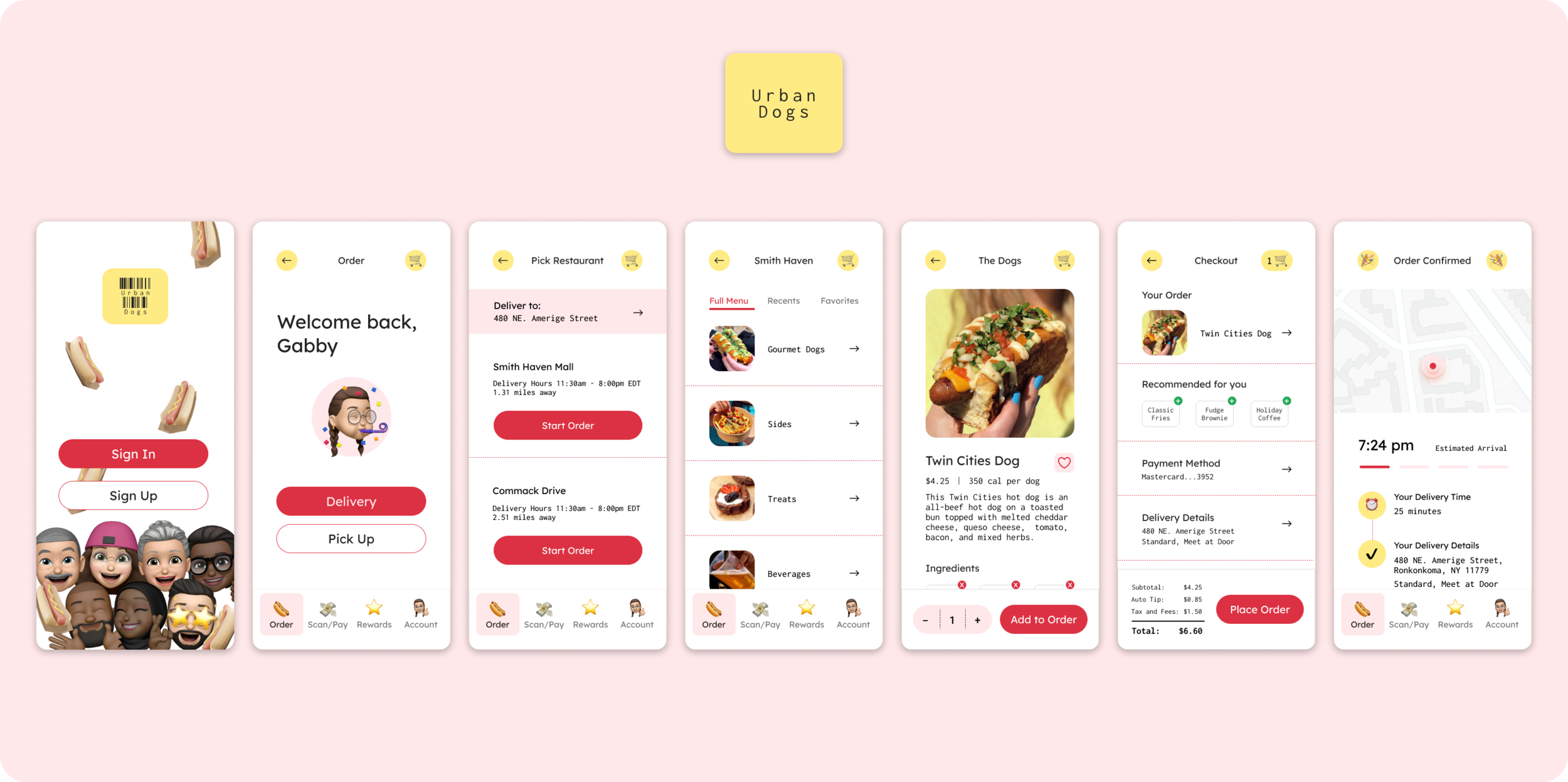
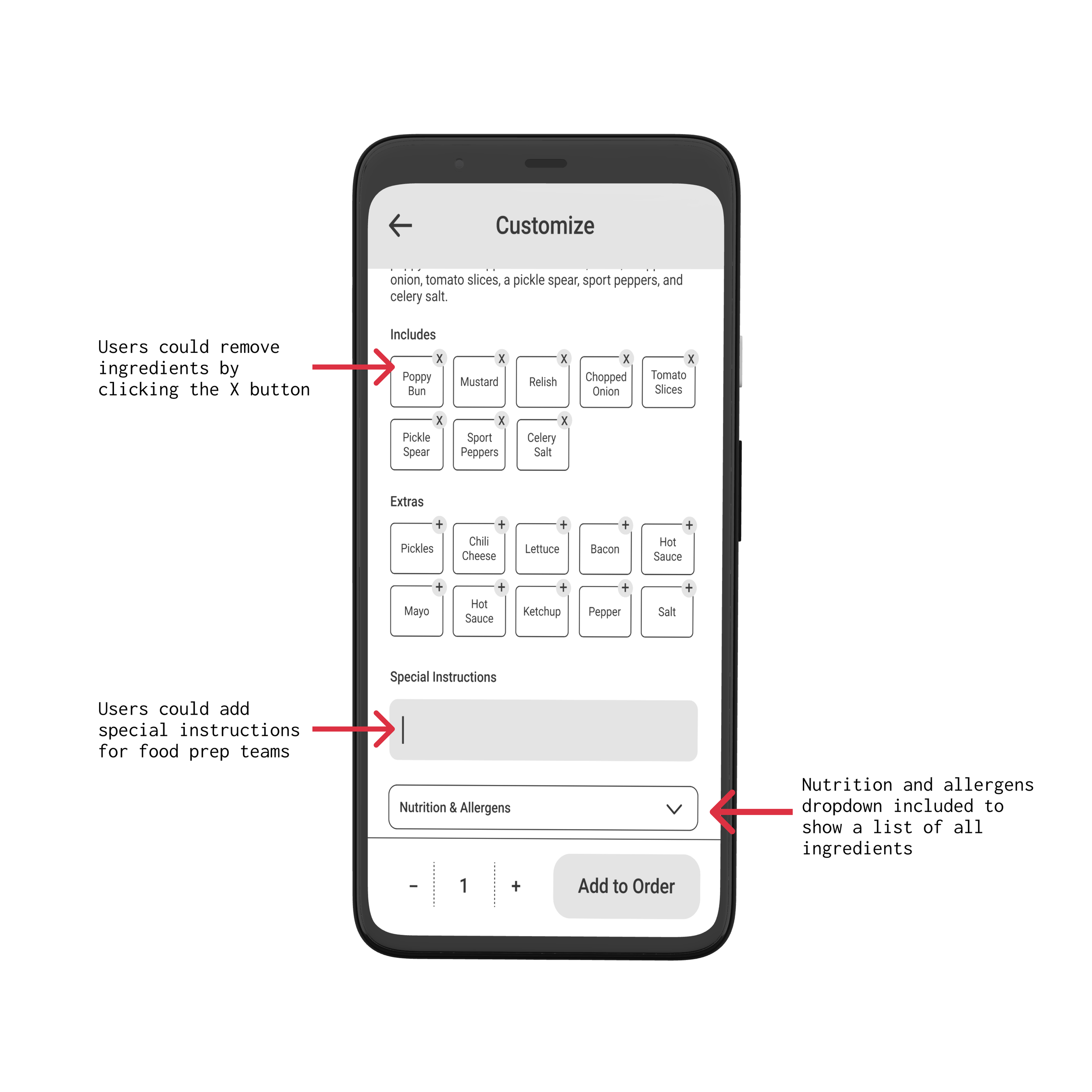
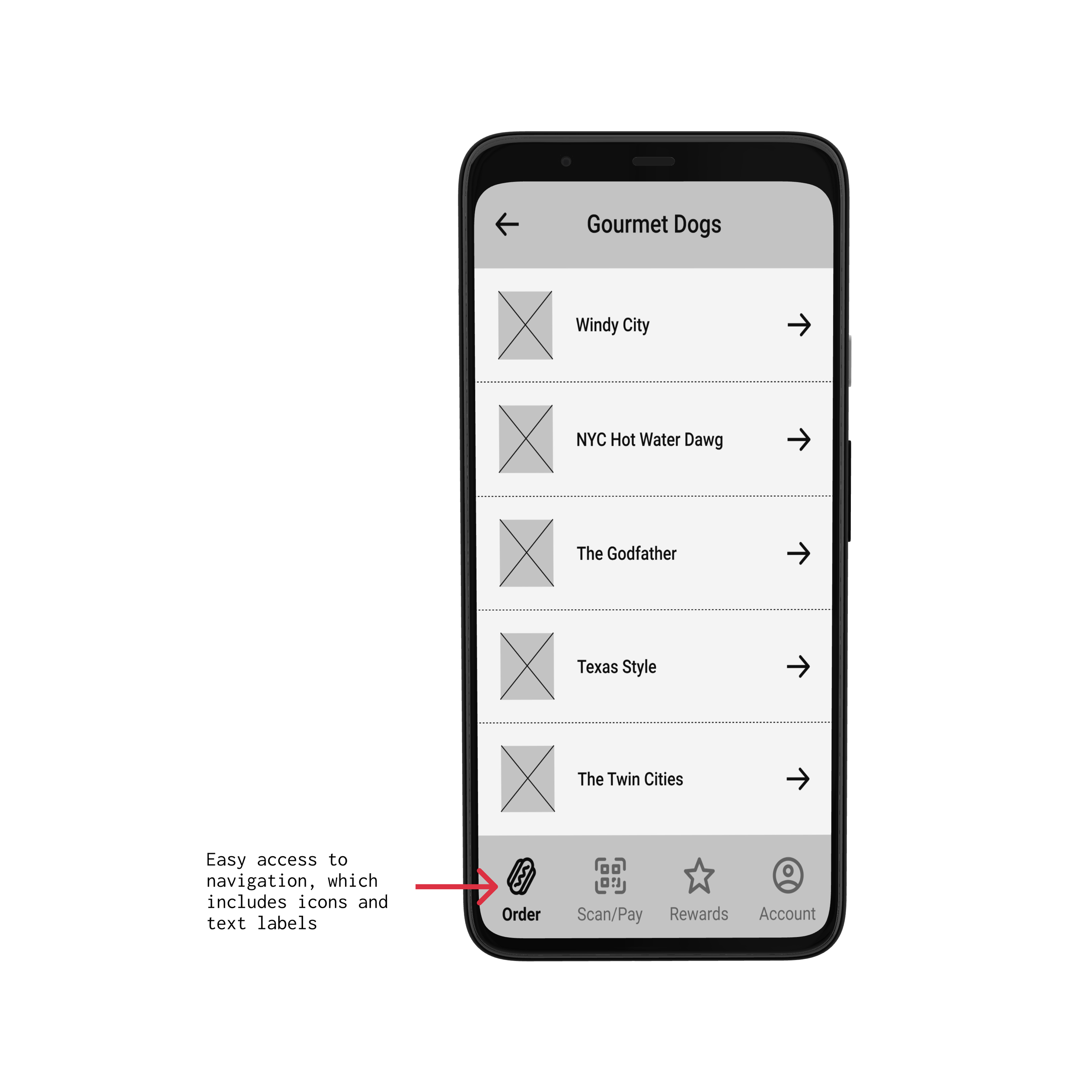
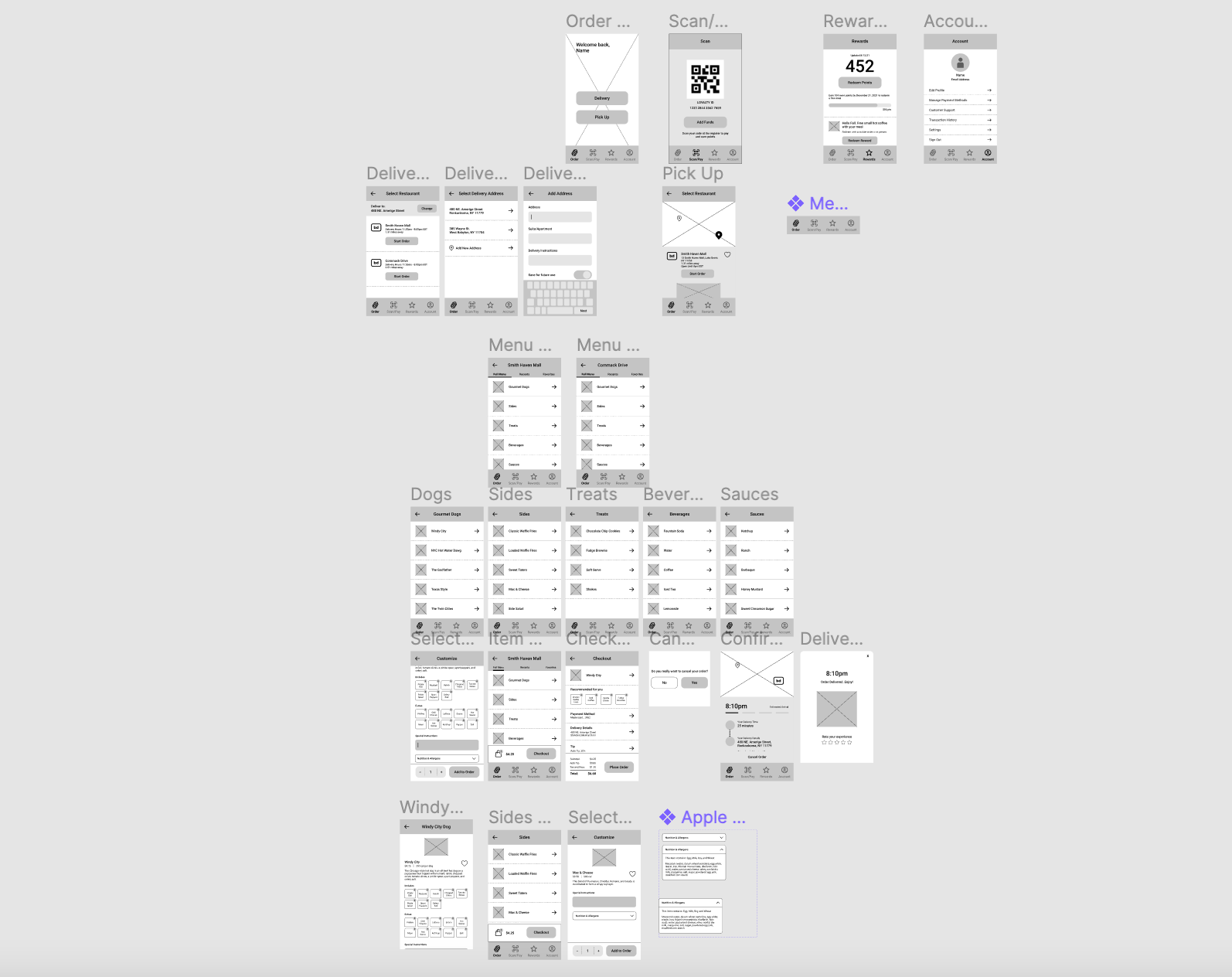
High-fidelity prototype
The final high-fidelity prototype presented cleaner user flows for ordering and checkout. It also met user needs for a pickup/delivery option, as well as more customization for food allergies. Check out the high-fidelity prototype below.
Accessibility considerations
I used simple design with minimal color to ensure vision impared or color-blind users could still access the app
I used emojis to help make navigation easier
I included an add or remove feature so users can remove ingredients. I also included a text box where users can manually add special instructions in case they have an allergy or dietary restriction
Impact
This app makes the ordering process quick and easy. It’s design is playful and simple, which allows users of any age to quickly order food.
“I want to try this hot dog! Nice job on keeping everything minimal. I knew exactly how to navigate the app and found it was super intuitive!”
— Peer feedback
What I learned
While designing the Urban Dogs app, I learned the power of research in driving design decision. Usability studies and peer feedback is essential in refining each iteration. I’ve also found that minimalism is a great way to create a better, and more accessible user experience.
Next steps
Conduct another round of usability studies to validate whether the pain points users experienced have been effectively addressed
Conduct more user research to determine any new areas of need
Try it out!
Click the image below to jump in the app!